Inspired by Game Design
Apps are everywhere. From onboarding new employees to managing vacation plans, finances, or classroom activities. But while games are intuitively engaging, many apps still feel like chores. They overwhelm users with cluttered interfaces, long tutorials, and deadpan design. With these fundamental tips, we begin to explore how lessons from game design can transform apps into approachable, daily tools people enjoy using while keeping focus on their goals.
Why look to games for inspiration? Because game developers are experts at motivating users, guiding them through unfamiliar systems, and making every interaction rewarding. Games succeed when players are immersed, learning, and enjoying their time. All goals that translate well to any software experience.
Why should companies care? Because the easier and more enjoyable an app is to use, the more often people will use it and share it. Whether you’re building an internal tool, a public-facing consumer app, or an educational platform, increasing user engagement and satisfaction leads to better outcomes: more data collected, tasks completed, lessons learned, or purchases made.
Here’s how to start making that happen.
Add a Dash of Fun: Smart Gamification
Gamification can make an app feel less like a tool and more like a treat. But it has to be done right: lightweight, relevant, and rewarding.
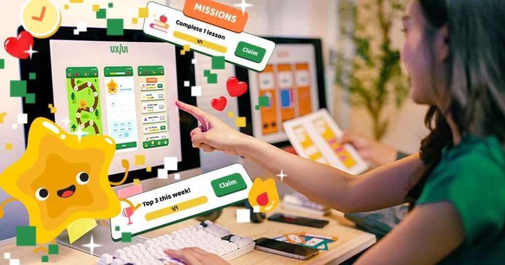
Effective gamification strategies include:
- Progress indicators with mini-goals: Show how close users are to completing a task. This helps them avoid feeling lost in a long, tedious process, like a survey, and gives a sense of accomplishment with each step.
- Achievements: Even just acknowledging completed tasks makes users feel like they’re doing things right. Achievements can also encourage them to explore additional features or stretch their use of the app.
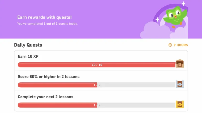
- Streaks and daily check-ins: Encourage regular engagement and give loyal users a sense of recognition. People love being “on a streak” and will often return just to keep it alive.
- Mini-challenges: Add optional tasks that promote exploration or learning, helping users discover underused features.
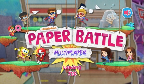
Apps like Duolingo have mastered this, using XP, streaks, badges, and character reactions to motivate users every day. Just remember—gamification should support your app’s purpose, not distract from it.

Cut the Notification Noise
Push notifications are one of the most effective ways to retain users—when used carefully.
Best practices:
- Limit push notifications to once per day, especially for new users.
- Make them useful, not promotional. Understandably, marketing is important. So, at least give them the option of controlling what types of messages they receive.
- Avoid “red dot” overload: excessive alerts create stress and train users to ignore them.
- If it’s not helpful, it’s harmful.
For example, my banking app always has a red dot on the message icon. Important alert? Nope—just another marketing promotion. Several a week, then daily. Eventually, I stopped checking it entirely.
Duolingo is known for persistent notifications. It works for them because they’ve embraced a brand persona that’s quirky and entertaining, with the intend to creating a daily study habit. Most apps won’t get that luxury. Earn your users’ trust. Don’t try to pester them into returning.
Deep Link Those Notifications
A common mistake: the user taps a notification about a feature and lands on the homepage, unsure what the alert was even about.
Use dynamic deep links in your notifications and internal messages to take users directly to relevant content or actions so they don’t have to hunt for them.
Clash of Clans handles this well. When you tap a reward or event alert, you’re taken directly to that feature. No searching, no confusion. That immediacy reduces friction and improves conversions and make your messages more than informative, they become useful.
Teach with Play: Quick & Visual Onboarding
Games excel at showing, not telling. They introduce players to new features and screens contextually, not through long tutorials. Apps often do the opposite—overwhelming users with walls of text before they’ve even done anything.
Best practices:
- Let users start immediately—don’t make them swipe through a 10-page slideshow first.
- Use visuals, tooltips, and animations to guide behavior. Give them an overview of the purpose for each new screen and let them get more tips if they need them.
- Keep instructions relevant to what users are doing in the moment.
- Allow users to skip, dismiss, and revisit tutorials easily. Everyone skips a tutorial step they probably needed. Let them trigger it again from the help menu or a button on the page.
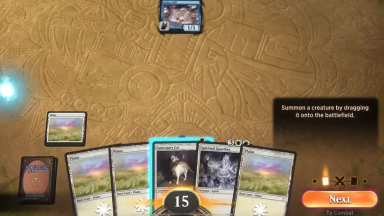
Monument Valley introduces mechanics visually and wordlessly. Among Us and Magic: the Gathering Arena onboard through short text and key interactions. Both quickly get users from “unfamiliar” to “engaged” without being overly handholding or complex.
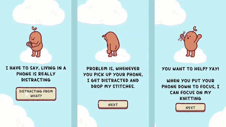
Give It a Face: Mascots and Personality
In Japanese business culture, mascots (called yuru-chara) are everywhere—used by banks, police departments, and even cities. Why? Because they humanize the brand, soften tone, and create emotional connection. This is starting to trickle to the west as more businesses take on avatars for customer relations and marketing beyond the kids/family markets.
A good mascot:
- Offers a recognizable visual identity and helps users remember your brand.
- Acts as a helpful guide or narrator for tutorials, help systems, and AI functions.
- Makes the app feel alive and approachable.
- It relatable and understood.
Duolingo’s owl is a masterclass: it’s funny, educational, and even meme-worthy. But it’s a hard model to copy, nor should many strive to. Focus Friend by Hank Green takes an alternative approach with its cute and customizable Bean who doesn’t threaten to hurt you when you miss a focus break.
Whether you choose a bull for your finance app, an owl for a sleep tracker, or a human doctor for your clinical app, a character can be your app’s voice without sacrificing professionalism.
Personalization Makes It Theirs
Letting users personalize their app, even just a little, creates a stronger connection. Going too far, may impact your brand or, worse, usability.
Easy ways to offer personalization:
- Allow navigation shortcuts. Let users pin frequently used features to the home screen or nav bar. This cuts down on repetitive navigation and helps them feel like the app understands their habits. It’s especially useful in apps with deep hierarchies, like banking, HR, or productivity tools, where users may only need 10% of the functionality 90% of the time.
- Show recently accessed or favorited content upfront. This allows users to resume where they left off, reducing friction and saving time. It’s a technique used effectively in streaming apps like Netflix (“Continue Watching”) or note-taking tools like Notion. Games use this too—jumping you back into your last level or bookmarking your favorite game server.
- Offer light profile customization (avatar icons, themes). This gives users a small sense of ownership without compromising brand consistency. Even subtle personalizations, like dark mode, accent color choices, or choosing a mascot avatar, can help the app feel more welcoming. Most modern games offer cosmetic customization as a basic feature, which subtly reinforces identity and habit. Apps can tap into that same psychology.
Games let players customize their characters, controls, and settings. Apps can offer similar perks—let users create their own shortcuts or bookmark areas to cut through the clutter. In a banking app, for example, why make someone tap through five screens to check the same balance every day? Let them pin that account for one-tap access.
Make It Feel Good to Tap
Games feel great to play not just because of the gameplay—but because they’re responsive and tactile.
Micro-interactions matter:
- Buttons should animate and be enjoyable to tap. Even a subtle bounce or glow can signal that the app is responsive and listening. It’s that tiny moment of cause-and-effect feedback that makes users feel in control.
- Completed tasks should give visual confirmation: Checkmarks, color fades, bursts of celebration. This is especially effective in task-based or data-entry apps. Visual feedback like a checkmark or small “success” animation triggers a sense of accomplishment. Apps like Todoist animate completed tasks with satisfying fades or swooshes. Games do this constantly, whether it’s confetti after a level-up or a badge for finishing a goal.
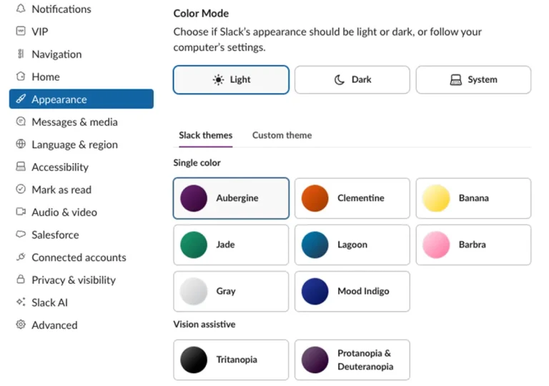
- Use quick transitions and satisfying loading animations. Nobody likes waiting, but well-designed transitions can make it feel shorter. Apps like Slack use playful loading animations to entertain, while Acorns’s personal investment app adds polish to financial transactions with smooth visual transitions. Games, too, use quick scene wipes or animated loaders to hide delays and make experiences feel cohesive and fluid.
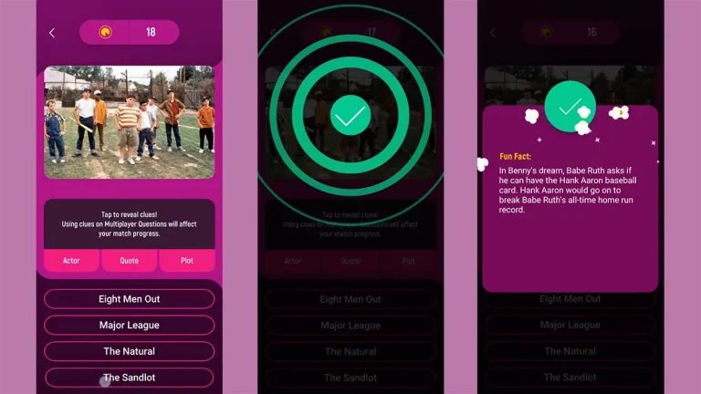
Even serious apps benefit from tactile feedback turning a mundane experience into a fidget toy that users can’t put down. It shows care and quality, and invites users to keep interacting. The Noovie Trivia App is a good example of how simple multiple choice trivia can be designed to be engaging and satisfying in a variety of ways.

Interactivity = Joy
Games are built on interaction. Players aren’t reading, they’re doing. The same principle makes apps more enjoyable. Don’t just show data, let users manipulate it.
Add interactivity:
- Graphs with draggable markers, hover-to-reveal details, and dynamic filters. Interactive data visualizations give users agency and clarity. Rather than static charts, apps like Google Fit or Robinhood let users scrub timelines, tap into data points, and view contextual insights instantly, transforming data into a conversation, not a lecture. Games use similar techniques in skill trees and stat tracking to make complexity feel approachable.
- Sliders for setting goals or time ranges. More intuitive than typing numbers, sliders add tactile engagement to decisions. Fitness and finance apps often use these for target setting, budgeting, or filtering.
- Swipe gestures with visual feedback. Gestures streamline interaction and make mobile use feel fluid. Swiping to archive, mark complete, or switch tabs should feel deliberate and be paired with motion and feedback. Apps like Tinder, Gmail, and even Apple Mail use this well making message management just a touch more enjoyable.
- Animated screen transitions to create a sense of place. Smooth movement between views helps users build a mental model of the app’s structure. Even a simple slide-left or upward fade can make transitions feel spatial, not abrupt. Games use this constantly—navigating menus, inventories, and maps with flow and rhythm.
Robinhood encourages interaction with scrollable charts and swipe-based controls for buying and selling, making finance feel surprisingly hands-on. Notion turns everyday editing into a modular, almost game-like experience: dragging blocks, toggling elements, and rearranging layouts with tactile ease. When users feel like they’re doing—not just reading—they naturally stay more engaged.
Putting the Fun in Functional: Why Approachability Wins
The best apps aren’t just usable—they’re inviting with style and a pleasure to continue working in.
One of the most valuable lessons from game design is that great user experiences are built on clarity, responsiveness, and delight. Navigation should feel fast and intuitive, guiding users naturally from one task to the next without hesitation or friction. Visual cues and progressive guidance help users move at their own pace, learning only what they need when they need it, without being overwhelmed. Every tap should respond with polish and feedback, making the interface feel alive and reassuring.
Even a clinical medical app, when thoughtfully designed, can feel smooth, approachable, and rewarding to use. These principles aren’t about making every app feel like a game—they’re about respecting the user’s time, intelligence, and desire for simplicity and joy in the tools they rely on every day.
About Workinman Interactive
For over 18 years, Workinman Interactive has helped the world’s top brands bring joy to digital experiences. From educational games and museum exhibits to medical and military apps, our team blends professional-grade engineering with accessible, game-inspired design.
Workinman brings clarity, playfulness, and polish to every project. Let’s connect and make your app something users will want to return to every day.